Tuesday 20 November 2007

Ashes and snow

Ashes and snow is an art project made by Leo Burnett. The artist was introduced to me by my friend Kyriaki. This particular project is very well presented in an interactive web site using up-to date technology managing to pass the sense of it to every possible web user. After exploring this web site and experiencing his work I became a huge fun of his art.


In exploring the share language and poetic sensibilities of animals, Leo Burnett, in this project, is working towards rediscovering the common ground that once existed when people lived in harmony with animals. The images depict a world that is without beginning or end, here or there, past or present. To give a full perspective to his concept, the artist uses multiple techniques such us photography (photo manipulations), filming , installations based on space and light and written narrative. Even the animations and the music of the web site add to the whole atmosphere that the artist wants to pass to the audience. I believe such artists should be an inspiration to us, as multimedia designers, because they extent all the possibilities and platforms with innovative ideas to make the viewers live a strong experience from their art.


Interactive Timeline


A few days ago, while researching for platform development project about the Elizabethan times, I found the web site of the upcoming movie “Elizabeth – the golden age”. Exploring its content I came up to a very interesting interactive element of the web site – an interactive time line for the Elizabethan era.


“Narrative serves to inform, educate, and entertain. It provides meaning, background and incites interest in what’s next” (Meadows)

Meadows theory can clearly describe that web application. A well designed interactive piece for web use, placed as an extra feature, serves at the same time an informative, an educational and an entertaining role at the same time. Using narrative structures and animation techniques, this interactive section of the web site, provides the user with all the era background information and incites the interest in what’s next – the movie.

In this application the content of narrative has been organized based in time creating a map for the user to navigate. The interactive asset of it gives the user the opportunity to explore the time line not linear as we would think for time based structure. I would say that the narrative is a nodal plot structure example. The user also has the choice to be informed about different parts of the era like the arts, Queen Elizabeth’s life, foreign affaires, and exploration. In that manner the narrative structure is also based in categories.

Meadows, also mentions that interactivity is, like plot, based on fascination and captivation. And in that way this piece is designed. The flash-back technique, taken from video examples, is used in the animation when the time line is introduced to the user. That sets instantly the mood to the user. By viewing it one makes a journey back in time. In the same way also works the horizontal scroll and the quick movement from place to place when choosing a different age from the time line.

The user familiar with the time structure knows from the very start how to navigate and get the information. The feed back is quick helping the interaction to be useful to the user and well comprehend. The imagery and the typography, which are clear and appropriate for the application, result a successful and impressive design.

The only negative asset, that I would like to point out, is that after navigating in the time line referring to Queen Elizabeth’s life, which offered in depth information for its part of it, I noticed that for the other categories there is no further information apart from the ones set on the time line. I understood that there was an intention to concentrate more to the queen’s life as it is the movie’s theme and give the rest as further information but used from the navigation in the first part I was looking for in depth choices in the rest of them too.

To sum up by using interactivity and the elements of narrative the designing team of this web site made an excellent choice with this extra feature giving the user the opportunity to live an entertaining, informative and educational experience.

Visit from Enterprise - Setting up a small business


A few weeks ago two members of the enterprise staff introduced us to setting up a small business. To understand this process we were separated in two groups and we were given a brief. Based on the brief we had to play a game completing certain tasks and then present our ideas and persuade that our business idea was the best.

The brief:
* Organic food box scheme
* New graduate business
* Delivery service
* Market research showed that there is a growing market for locally produced food and other items.
* Aspirations to build a brand identity for our company and create a company loyalty with excellent customer service
* Expertise within the company: marketing, it, logistics, sales
* Limited start up capital  find investors or bank loan

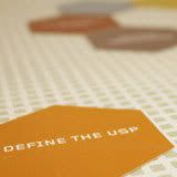
Also each team was given a set of small cards, a booklet, and a board placed in the center of the table.

After reading carefully the brief as a team, we had to discuss how we were going to build our business and make a small research in what areas, target group and methods we wanted to focus.

We decided that we were going for an organic ready-made food brand serving high quality products. Our target group would be the busy suits of urban centre businesses. This group has expectations for high quality and doesn’t focus on the price. Also is a very busy group that has no time to prepare something for lunch. Our focus areas for delivering food would be business parks or big office buildings in the city centre and the areas around it. We would offer sandwiches, soups and salads. Very important based to the target group would be the delivery packages. So the food would be nicely placed in boxes (like a lunch pack). Another thing we had to think was the way that we would deliver our food to the customers. One thought was to have a van like stall and go from one place to the other in certain times or using stands in certain areas. Also we thought of just a basket delivery on an on call demand. In the end we decided a combination of a mini van nicely decorated which would be used to transfer the staff to the places after a call or an online order. The stuff would carry baskets with food to the buildings at preset times also.

After building our brand image we had to decide a name and a mission statement for it. The name of our brand was “The green machine” and our statement was: “Specialist healthy food for the busy suits in urban centre”.
Both this assets had to be written down on a post-it and to be stuck on the low left corner of the board.

The goal of our brand had to be decided then. As we were taught when we set a goal for a business we have to think a combination of time and expectations.
A goal has to be set for certain period of time like six months, a year, or ten years. Our goal had to be set for one year period. My team find it hard to set this goal. As young and excited for setting up a small business with no experience in the field we went far beyond the limits of our business capabilities. We were expecting building a farm and also make a profit of 1.000.000 pounds. After a small conversation with the enterprise members we understood that we had to be realistic. A farm would cost us much more than we could afford for a first’s year plan. So with some calculations we lowered our goal to 100.000 pounds profit, a fully developed delivery system and connection with major food companies. Our goal was written to another post-it. We stuck that one on the high right corner of the board.

As we noticed the board was separated in three diagonal areas with different shading. Each zone was representing a time period of our plan. The first one close to our mission statement was the start up period. The next one was the mid time and the third one, close to our goal, was the future.

After all this preparation the game started. We had to read, in rotation each one of the card. One of us would use the booklet to explain all the terms written to each card and as a team we had to place it in the correct time period of the board based on our goal. The cards were in polygonal shape. We also had to place the cards with related terms one next to each other. As we linked the cards we were creating a hive shaped root from our mission statement to our goal.


I found this procedure really complex. First of all it was difficult to work as a group as we were a lot of members in each group and each one of us had a different opinion of how to set things. It was also very difficult to understand all these new terms and decide which one of those are appropriate for our case study and in which period to place them. I realized also that a lot of the terms were quite similar with slight differences and that made it harder to decide. We reconstructed our root about three times and still I think we were not sure if it was correct. There were many disagreements on whether we were going to use certain staff or marketing methods. We also noticed that the busy period was the beginning and actually the time before our brand would even start working. Business plan, bank research, marketing methods, law related terms were packed on the very start of the root. Then building up the path we had to place branding and design assets, as well as staff hiring. Going closer to the end we placed terms related with future planning.

Finally we had a period of time to organize our presentation. My team tried mostly to impress and focused more on how to present the idea rather than on what we will present. Thus, the content and the structure of our idea were not well presented. Although we showed a flare of excitement with the small video that we produced, the idea of the other group won over ours. I believe not because it was better but because it was presented much more organised and solid.

From that session I found a lot of useful information about how I will structure my personal business idea and a lot of resources on where I can get help on doing that. I also understood the importance of having the correct team mates to build a brand – people not only excited to work but also creative and with excellent organizational skills. A fresh idea is not enough to be successful. It needs the correct planning and an on-going progress to achieve its goals.

Useful links:
enterprise: http://www.ljmu.ac.uk/Startup/68329.htm
the game was made by: http://twkg.net/
other links: business link
unlock your potential

Tuesday 13 November 2007

Liverpool 2008 Info Bus

The alarm rings!!! I have to wake up! Not good… it’s too early but errands have to be done on my day off! I still wanna stay in bed… No no no there are things to be done! Come on wake up! No excuses! It’s a cold windy morning and yeah above all it starts raining! My friend and I, apart from the frustration to get everything done on time, just got soaked too! So we keep walking, all wet, through the grey streets of Liverpool City Center. And here it is! A colorful crazy bus in the middle of Williamson Square! How could someone resist to its bright view and the sign calling you to get on board?

I surly could not and neither could my friend.

Going closer I noticed that all these bright colors I could see from distance where childlike designs describing the most characteristic things about Liverpool. A traditional British bus was transformed to a joyful stall! Reading the sign I found out that that was an information kiosk for Liverpool Capital of Culture 2008. All excited and curious we got on board.


Getting inside we faced a nice warm yellow room with a help desk full of brochures and booklets on the right. Straight in front of us there were two screen sets connected with head phones and a cute little device in front of them. It reminded me of baby toys with nice big rolling buttons and bright colors as well as a gaming console joystick. And yeah that was a navigation device! The yellow rolling surface was moving the cursor around and the blue round buttons on the sides were working exactly how the right and the left click work on a regular mouse. Easy to use as you connecting it naturally with similar previous experiences and I am sure very appealing to the younger ages that visit the kiosk very often as we were informed later from the staff. I, also, noticed an older age lady, who seemed not that familiar with technology, how easy was able to navigate by touching clicking and rolling this intuitive device. That's is a very important element based on the puprose of this installation. An information kiosk is visited from a big range of ages, cultures and backgrounds as it helds a tourist and educational role at the same time. Thus, it is essential to design it approchable and understandable for a large target audience.


More and more excited, we are still exploring the space; more brochures on the back nicely placed on wall holders and one more screen playing videos. Through a stairway you can go up where there are more screen sets. After walking around the spaces we put on the head phones and dive into the screen displays.


A very nice minimal designed menu helps you to navigate to different information pages or videos. Everything follows the same design logic; colorful, fresh, enjoyable and easy to navigate. I was amazed by the transition animations from one section to the other made from cut-off paper child drawings. The sound, the motion and the typography, all the design assets combined with one common goal; to entertain and to inform the visitor about the history of Liverpool and all the exciting events coming up! The entire environment and feeling easily infects the audience with excitement and expectations for all the events coming up in Liverpool 2008 Culture Capital!


We left the kiosk packed with brochures and leaflets, a big smile on our faces, a DVD visitor souvenir with the history of Liverpool and … a loud “I can’t wait!”! No doubts that this interactive experience was worthwhile, well designed and successful for the purposed that it was set up.

Digital Painting Canvas Installation Review

Last Friday, Kyriaki, Paul, Nicola (3rd year students of i-media) and I organized a small tour around Liverpool Museums to experience interactive pieces and research how installations are used for educational reasons. The World Museum of Liverpool held an interactive exhibition named “eye for Color”.Packed with hands-on exhibits and interactive displays, this exhibition explores the endless ways in which color shapes our world.
The most challenging piece for me was the "The Art Machine". I could describe it by using just three words - digital painting canvas. “The Art Machine” is consisted by a big projection screen looking like a painting canvas, three projectors made like shooting devices and a touch – screen display. The "shooting" projectors, each representing one of the basic colors, red - blue - yellow, have buttons on the sides allowing the user to aim, choose the size of the brush and shoot color on the canvas. There are also buttons that give the option to spin around or clear the canvas as well as to save the creation. Then using the touch-screen display one can email it or see the creations that have been saved in the past.


This interactive exhibit is made for young children. Watching it you understand, from the very beginning, how to interact with it. The big screen made up as a canvas automatically makes you think that is meant for drawing on it. The projectors’ use also comes natural to the users, as especial the young children, are used in playing with the gaming machines using buttons to aim or shoot. The process is enjoyable and mixing the 3 basic colours on the canvas the children learn about colour mixing, how you make green for example or that if you put more blue the colour becomes darker. Experiencing the game was fun even for us, the “big kids”. A big colour war began among us on the digital canvas!

Also the feed back you get when interacting with the installation is quite good. Every time you aim you can see where you aiming at or how big is your brash. The sound effects also are matching the size of the colour you shoot setting up the mood for the user. Another asset that enhances this user friendly application is way the buttons are made. Big bright colour buttons with matching icons make, for every kid, their use comprehensible. Based on the target group, the choice of a touch screen display is very effective. Children are use to touch things and enjoy to explore using their hands.

According to Norman’s theory the conceptual model of that system could be defined from:
a. Its affordances which are the fundamental properties that determine just how the thing could possibly be used. For the installation that is being described the virtual canvas affords to be drawn. Also the system has been made from appropriate materials as is meant to be used by young children. The shooting device image of the projector affords to project light images - colours - on the canvas.
b. Constrains which are the ways used to limit the possible actions that a user shouldn’t do. In this case, the canvas is lighted in the center giving a circle light – shadow effect that sets the barriers for aiming on it. Also there are some semantic constraints as the projectors are pointing to the centre of the canvas so the user knows where to aim from the very start.
c. Mapping that describes the relationship between two things. In this case a natural mapping is used taking advantage of physical analogies and cultural standards which lead to immediate understanding.

Concluding I would say that this educational installation fulfils its goals to entertain along with teaching young children. It’s appropriate and well designed for the target audience as it is easy to use and to understand as well as fun to play with. It’s an enjoyable experience that should be an example for many museum installations.

Monday 12 November 2007

Splinter's Portfolio Tips


As a part of "Professional Practices and the Workplace" module two members of Splinter's staff came to our class to advice us for our personal portfolios. Here are some of the tips they gave us:
1. Keep a neat and clean portfolio
2. A printed portfolio is a good idea as a complementary of our presentations
3. It is good to show the whole idea for each project emphasizing with the size and the placement the main central piece.
4. In the printed portfolio each project is nice to have a little text with the main assets of the project like target group, project name, time, small brief.
5. The printed portfolio can be updated or altered based on the purpose we are showing it.
6. If we send a cd we should make it interesting. No one will mind spending some time to see something that stands out.
7. A good web site for prints is: www.motionflyers.co.uk
8. Always submit a CV as a PDF file format.
9. During our project presentations in an interview it’s good to talk about functionality and accessibility and as well about the design process.
10. A web portfolio is essential for a web or multimedia designer. It can be a personal web site, a profile in myspace or deviantart or even a blog.
Also a few good ideas from design magazines where shown as inspiration for our own portfolio.

Designing Interfaces - Paper Prototypes


On the 29th of October Martin Chapman from Mando group gave us a seminar about designing interfaces and creating paper prototypes for user testing.
We were separated in groups of four to complete a task. The task was to design applications for the i-phone .
The design process began with brainstorming. Each teammate wrote down all the ideas, even the craziest ones, on post-its and randomly stuck them on a big piece of paper. The next step was to organize the different ideas in good and bad.


And then organizing continues by separating the “good ideas” into categories, posting the paper on the wall so we would have a well view of our ideas, and then end up choosing our 3 killer applications.


After that we had to talk about how we could apply these applications to the i-phone so there are friendly to the user and easy comprehend.
First we had to consider the navigational techniques that are used in the i-phone such the multi-touch screen, the way that the different pages change, the use of the icons and the size of the screens. We also thought about what we wanted our user to experience.
Designing continues with the creation of paper prototypes that are used for user testing. As Martin Chapman mentioned making a paper prototype for user testing before we continue to a demo version of our application save a company money and time as it’s a quick and a very effective method to test a possible product.
Thus we started sketching on paper 2 different pages for each application and one main page for the navagation. Our team chose a tablet designing program, a robot application with witch you could control, set on or off, home electrical devices, and a tracking locator application which shows where the location of the phone is every time. Each member took one application and the one left designed the main page.


After finishing the designing part we had to start the user testing. One teammate had to take the role of the device turning the pages based on the user’s reactions. One had to give the user 3 tasks to complete based on the applications like drawing a sad face and save the file or setting on the coffee maker at twelve o’ clock.The third person of each team would take notes of the user's reactions to each task and the fourth member would test another team’s applications.
Our team faced a lot of problems during the user testing. Some of the illustrations were very confusing to the person who was testing them. On the other hand, I would say that the person that was chosen to test our prototype was not in the target group of our applications as she had many queries about the use of the device or what you can do with a tablet in a designing program.
From that seminar I understood how important is to understand all user's needs and to predict the problems that might occur in his interaction with a media platform. The designer’s role is to find solutions for all the problems and make every application approachable by the target audience. Also it’s very important to have a clean and easy to comprehend interface to avoid user’s misleading or frustration. The key for the user center design is to organize well all the ideas, define the tasks and test from the very beginning if the idea works well for the user.

Interraction - an idea of pause and effect relationship

With what words could someone describe interaction? I will list some of them:
* involvement
* communication
* activity
* 2 way action
* input-output
* internet, letter writing, conversation.
Based on Crawford's theory interaction is a cyclic process between two actors alternatively listen, think and speak.
To understand this term and the role of the two actors in an interactive experience during the lecture we were separated in groups of two to complete two tasks.
In the first task one of each team had to close his/her eyes and the other one had to give him directions how to walk a random root in the classroom.

In the second task, one of each team had to lay back on the floor and the other one had to direct him standing up with one move at a time.
Experiencing both tasks I came up with the following results:
a.To direct someone is like designing an experience for him/her. The one who gives the instructions has the role of the designer or the interactive platform and the one who follows his/hers directions has the role of the user.
b.Communication is a key to complete that experience successfully. The language, the voice tone, understanding the directions, clear and immediate instructions are some of the main assets that help someone to direct effectively and the user to comprehend easily the experience and how to react.
c.Another very important quality, in such experiences, is the trust which is built among the two actors. A clear message makes the user feel safe and less venerable. Especially in the first task, having your eyes closed, the expirience becomes really frustrating so trust becomes essential.
d.Feed back from both actors is nesessary to maintain that trust and enhase the communication between the two parts.
Practicing the second task and observing how the rest of the teams where reacting in it, I realized that it was really hard to complete it if the director would not try the experience along with the directed actor. The more time passed with unsuccessful attempts the more the person who had to stand up felt uncomfortable.
Summing up all of the above the duties of an interactive designer become more obvious. Every designer needs to be heard and to be understandable using clear and short instructions. He/she has to be precise and not misleading to avoid frustration. It’s very important to predict the issues or problems the user might have by experiencing the interaction from the user’s aspect. Every interactive experience is meant to be used by a target audience and it’s the designer’s role to design an accessible and usable root – interface – to communicate with it.

Sunday 11 November 2007

Interactive narrative

“Interactive narrative is the most ambitious art form existing today because it combines traditional narrative with visual art, and interactivity. Strangely enough, these three art forms share an important feature: They each allow information to be telescoped or compressed. Traditional narrative has tools such as foreshadowing and epiphany; Visual arts rely on point-perspective and foreshortening; Digital Interactivity uses iconography and expanding menus. These are all tools that do the same thing: convey perspective.” Meadows – Pause-effect article

And narrative is exactly that; the attempt of an author to convey a unique perspective.

After attending the narrative lecture and reading the “Pause – Effect” article by Mark S Meadows I set out to experience the “HOTEL – an interactive story” by H.Hoogerbrugge and produce by Submarine Channel.

It’s a wicked story with dark and odd characters created in flash. The story is about a mad scientist and his tests. The user can choose between chapters, episodes and parts to navigate through the plot. In each pat the user is given the opportunity to interact with different elements, not only to collect information, further comprehend and appreciate the creepy enigmatic story. Although the user can follow a non-linear gameplay, there is a start, a certain event hierarchy and an end to each of the story's parts. There are also subtle hints and indications for certain characters and events that the user should not miss in order to fully comprehend the plot.

Every single part of the story follows the “Freytags Pyramid”:
a.exposition, where the new character-volunteer is introduced,
b.climax where the dramatic act of the doctor’s tests on the volunteers is taking place
c.the denouncement where the results of the tests are shown.
The narrative follows an open plot structure as the user is capable of navigating from one part to the other on a whim. Yeah, there is a suggested path to follow as all the chapters, episodes and parts are numbered, but the user can anytime to stop exploring the part he is in, and explore something else.

One interesting asset of this interactive narration is the use of time. There is a time limit on exploration in each part. The user though has the chance to freeze time if more time is needed in order to interact with the characters or jump to other parts before time runs out. If the user does not choose to stop or jump through parts, the story continues, following the preset times.

The role of imagery is very important and complementary to the plot. The look and feel of the design adds to the atmosphere and sets the tone for the user's mood. The feed back is quick and accurate which is very important for successful interactivity.

According to Meadows, interactivity follows these steps:
1. Observation.
2. Exploration.
3. Modification.
4. Reciprocal Change.
In this interactive narration the user utilizes the navigation system by using the logic of books and screen series with parts episodes and chapters. First-level options include “enter the hotel” to start the narration by choosing a chapter. The user then explores actions and navigation. A small prologue and description of the character further illuminate what the next step is and how to react. To add to the exploration there is also a helpful manual for additional information on these topics, should the user need it. The modification part of the story's interactivity includes tthe user's "entry" in the hotel and all the character interaction options, time-freeze or jumps from room to room in order to follow the plot. The reciprocal change part contains the change of the dialogs, rooms or actions of the user in order to continue according to the part’s plot.
To sum up: "HOTEL - an interactive tale" is a great example of an interactive narration brilliantly crafted from the user's perspective. Easy to follow and simple to understand, the user ultimately comprehends the story and appreciates the game no matter his-or hers- chosen path.


Photo Installation by Daniel Canogar


One of the most interesting installation pieces of the “Manchester Urban Screens trip” was the photo-installation created by Daniel Canogar-which is a part of the exhibition in the corner house.
The artist by using a multi-projection system with fiber optic cables creates a live canvas on the walls. The different pictures are thus combined in a collage made from light images, eliminating the photographic frame and submerging the spectator into the image itself.
Watching the piece from a distance, you could identify a high-tech instalation, reminding one of the expressionistic machines from Metropolis' futuristic dystopia. GGetting closer one is temporarily confused - I kept expecting some kind of interaction by moving the projectors or using my hands' shadow to hide part of the imagery. After a few failed attempts, I finally realized the artists intention - A photograph that will embrace its spectator and utilize the space.
I got a magical feeling from looking in that installation - although others seemed to think of it as frustrating and pointless since it was not interactive by touch. And that is one of the problems that a public interaction might have; the artist has to predict the user's responses on to his piece. Or, as taught in our first lecture, creators must become specators themselves and live the experience of their piece in order to make it effective and communicative. But the users in a public installation vary in a huge range.
After some research on the artist’s projects, I found out that this one was one of his smallest installations. He plays with space creating giant installations by utilizing the aforementioned technique. The size might be a misleading aspect in this case. Watching some pictures of other installations from his website (http://www.danielcanogar.com/page_in/index.html), I am sure that an installation such as that, placed in a big room, using projections from a large amount of space and the walls would be much more effective to the audience and would communicate successfuly the artist's feelings.

One of my favourite pieces from his other works is named Sentience and is shown in the picture below. A live hand photo collage created by Canogar, Sentience explores the paradox of the desire to touch others through the intagible medium of the projection as stated in the artist's website.

The history of Liverpool in three screens

user's prespective
Visiting Maritime Museum I had the chance to experience an interactive narration on Liverpool’s history. This installation is a part of the current exhibition - interestingly named "magical History Tour". It is my opinion that this installation serves exactly that purpose by embarking with the audience on a magical tour through Liverpool's history.
To provide that feeling to the audience the installation is set up in a small dark, polygonal room where 3 big screens are embedded on the black walls, one next to each other, with a small space between each of them (see 1st picture).This isolated, dark background further enhances the shows's pieces and captivates the viewer.
It includes audio and video narrations. While a narrator - backed by an atmospheric soundtrack - familiarizes the audience with the city's past, a video is presented on the screens. The graphics, continuing from one screen to the other, provide a 3d perspective that embraces the audience and references the historical journey that is the presentation's main goal.
The visuals that refer to the past contain still images - mostly sketches from old books, as there are no video resources from that time. Although a slide show might have been expected, the way the screens are set up enables the smooth movement of video from one panel to the next - effectively creating a virtual world, an effect that is further complimented by the combination of graphics in different levels. You can almost smell the old leatherbound tomes in the videos and pictures as you are further immersed in the story. Going further to the story the graphics keep that “scanned-in old resources” look and feel combined with videos and pictures.
Helpful, easy-to-read text is plentiful and further informs the viewer while keeping up with the presentation's lively motion. The most important things, quotes and dates of narration are also pointed out in that way.
Thus, the audience is experiencing the city’s growth from a tiny fishing village to a busy port learning about the evolution of the settlement from its earliest pre-historic roots and examining life in the medieval and early modern town before the port’s emergence as a Victorian metropolis of global significance.
As described in "Understanding Hypermedia 2000", good design is a result of the following factors:
a. To meet the needs of the target audience
b. To be appropriate for it’s purpose
c. To attract the audience
d. To work well.
Based on all of the above, this Maritime Museum Installation is an example of great design. A very well made combination of audio and visual assets provide the audience with that "magical history trip" feel, as stated in the title of the exhibition and also serve their educational goal as a historical installation for the museum.


triple screen naration